modernizing charity
The challenge with this project was to make something out-dated and cliche into something modern that could be proudly displayed anywhere.
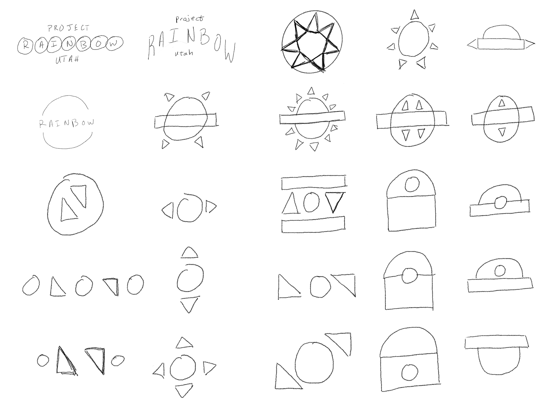
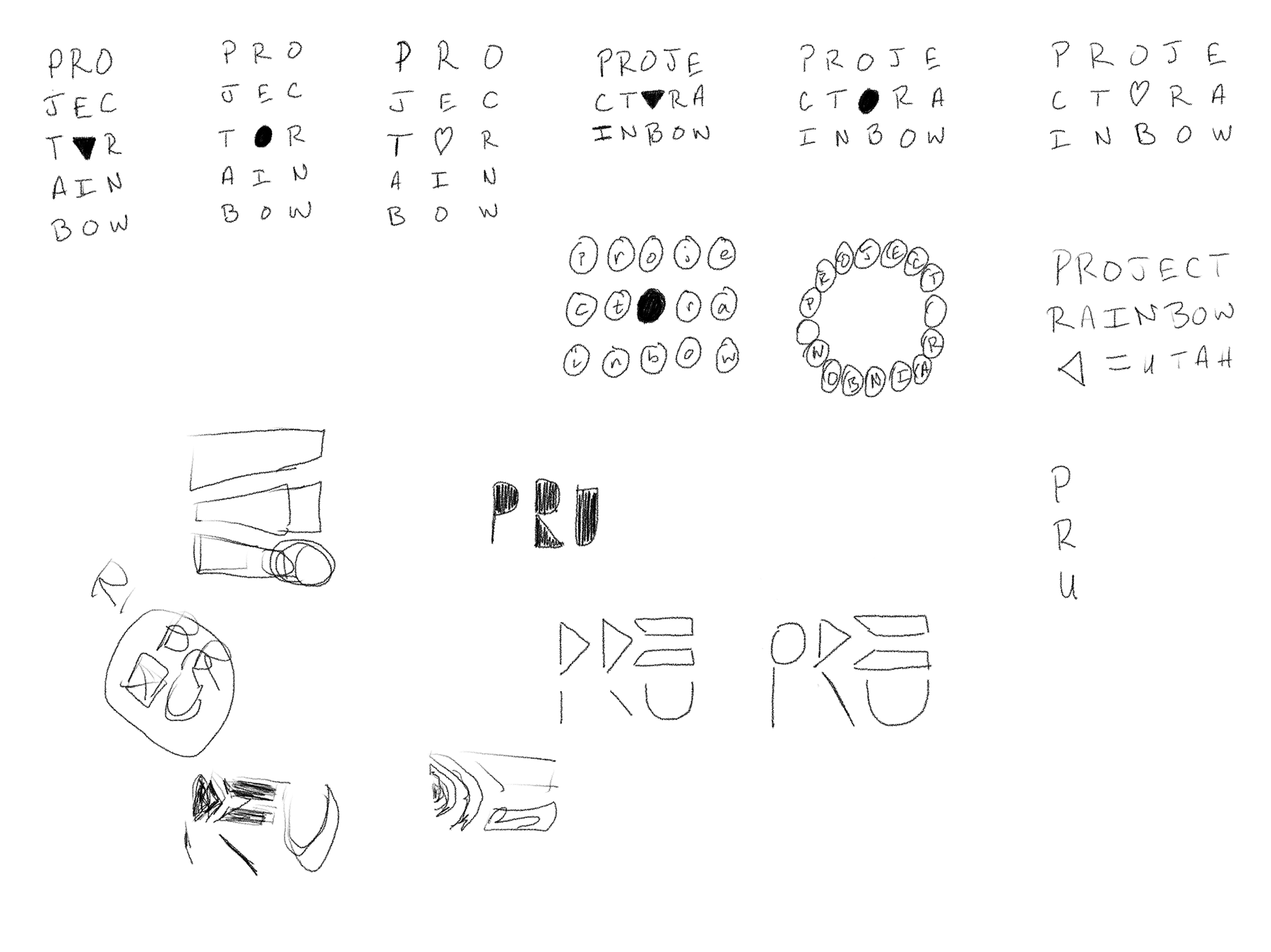
sketches
I wanted to make the brand more relatable to everyone so it wouldn't be specifically targeted to any one group.
refinement
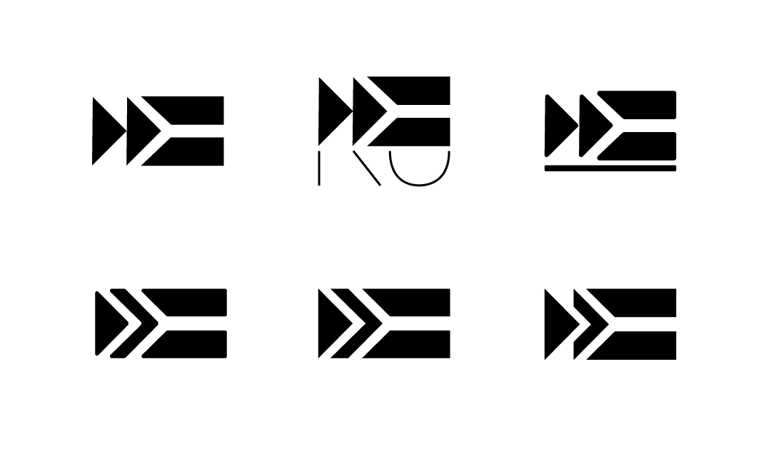
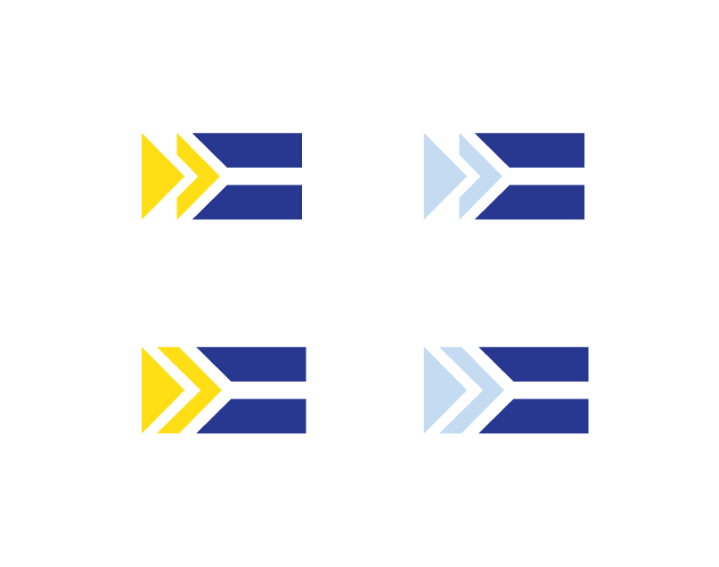
I then took what I thought was the best option for a general logo-mark and made other iterations in Adobe Illustrator to further the idea and get more insight into what would work best. I also wanted to add some color to make the mark unique and recognizable.
Final logo
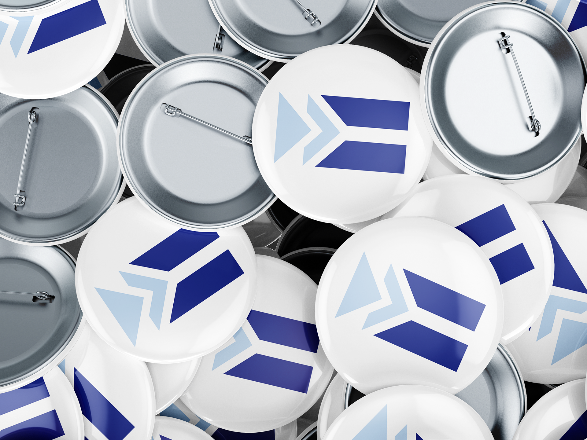
Two arrows pointing forward toward an equal sign to symbolize moving forward to equality.
adding text
I tried to find a good typeface that would help portray the sense of inclusion and fluidity that the brand stands for.
The challenge was to find a typeface that fit well with the logo mark but would also help reinforce the theme of the brand.
Alignment and letterform shape options using the same typeface.
Color
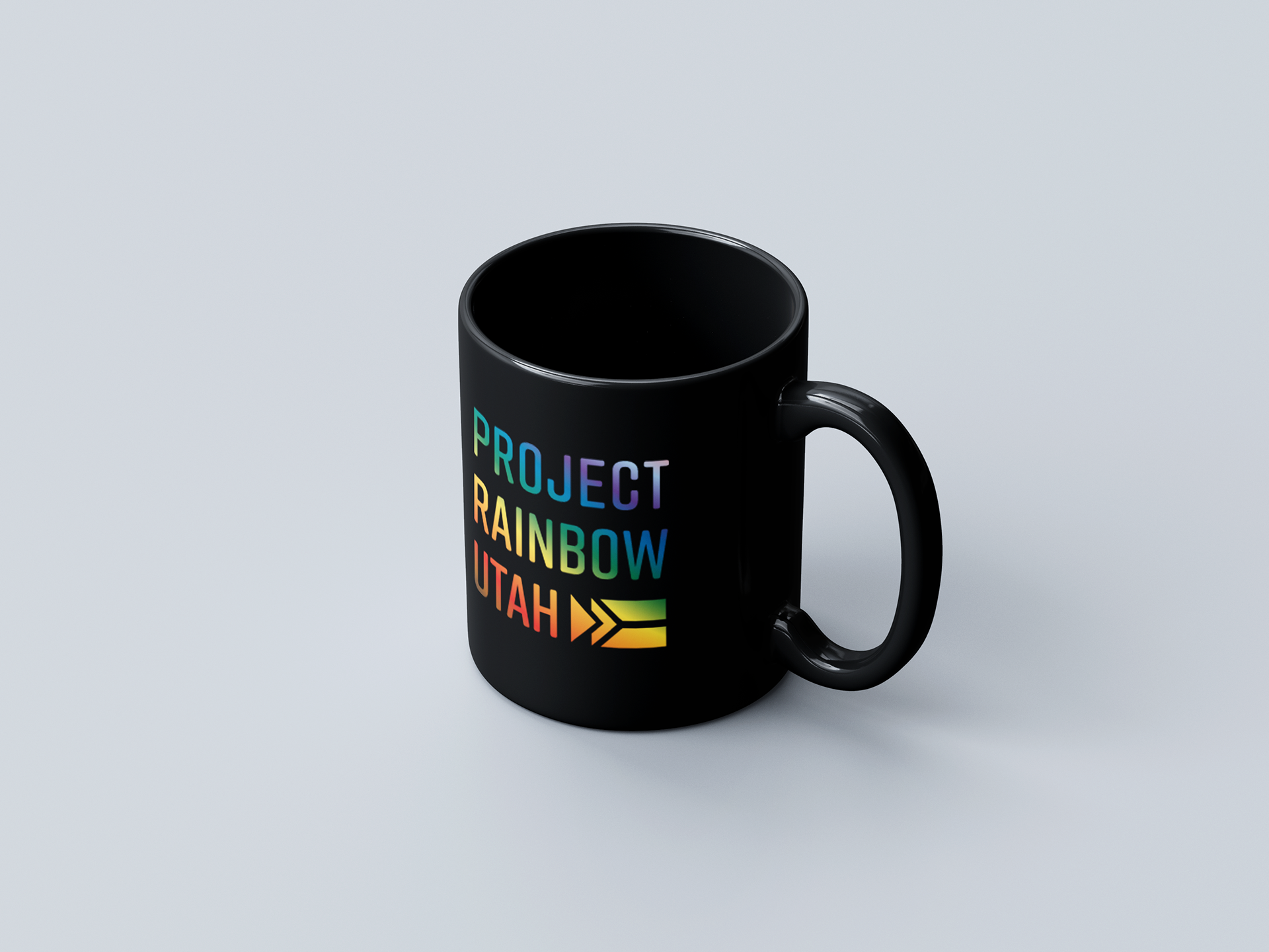
I wanted to steer away from the cliche of using the same colors for the rainbow as other brands that are similar. So I chose to use a slightly muted color palette to add to the modern feeling.
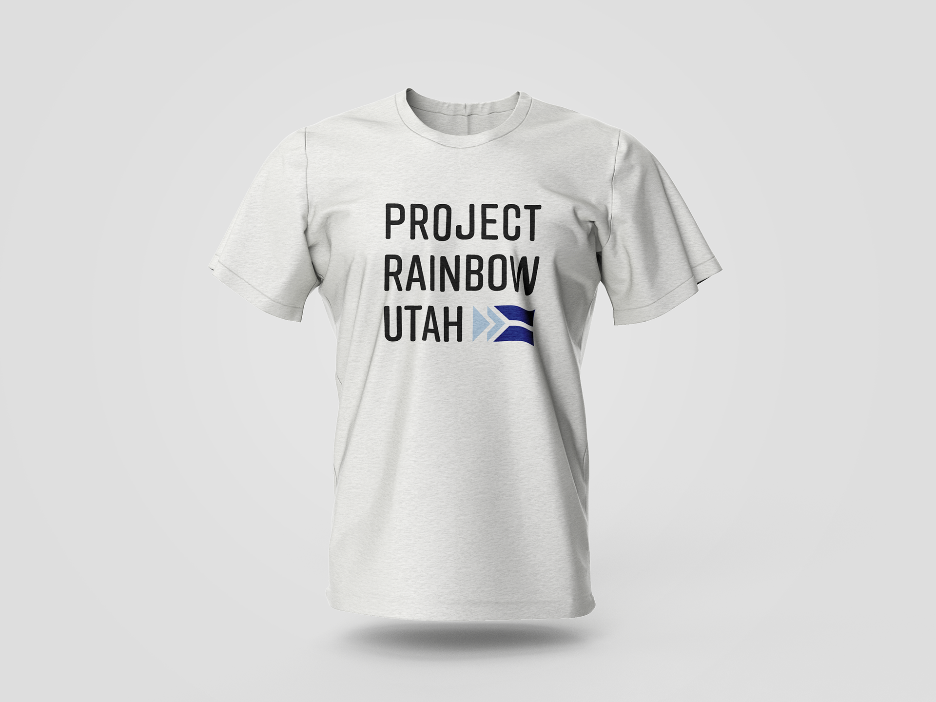
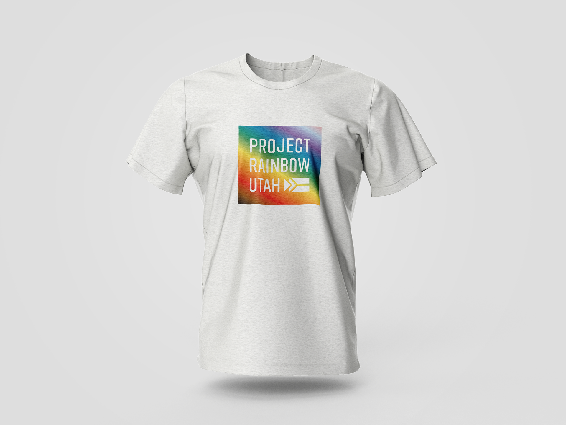
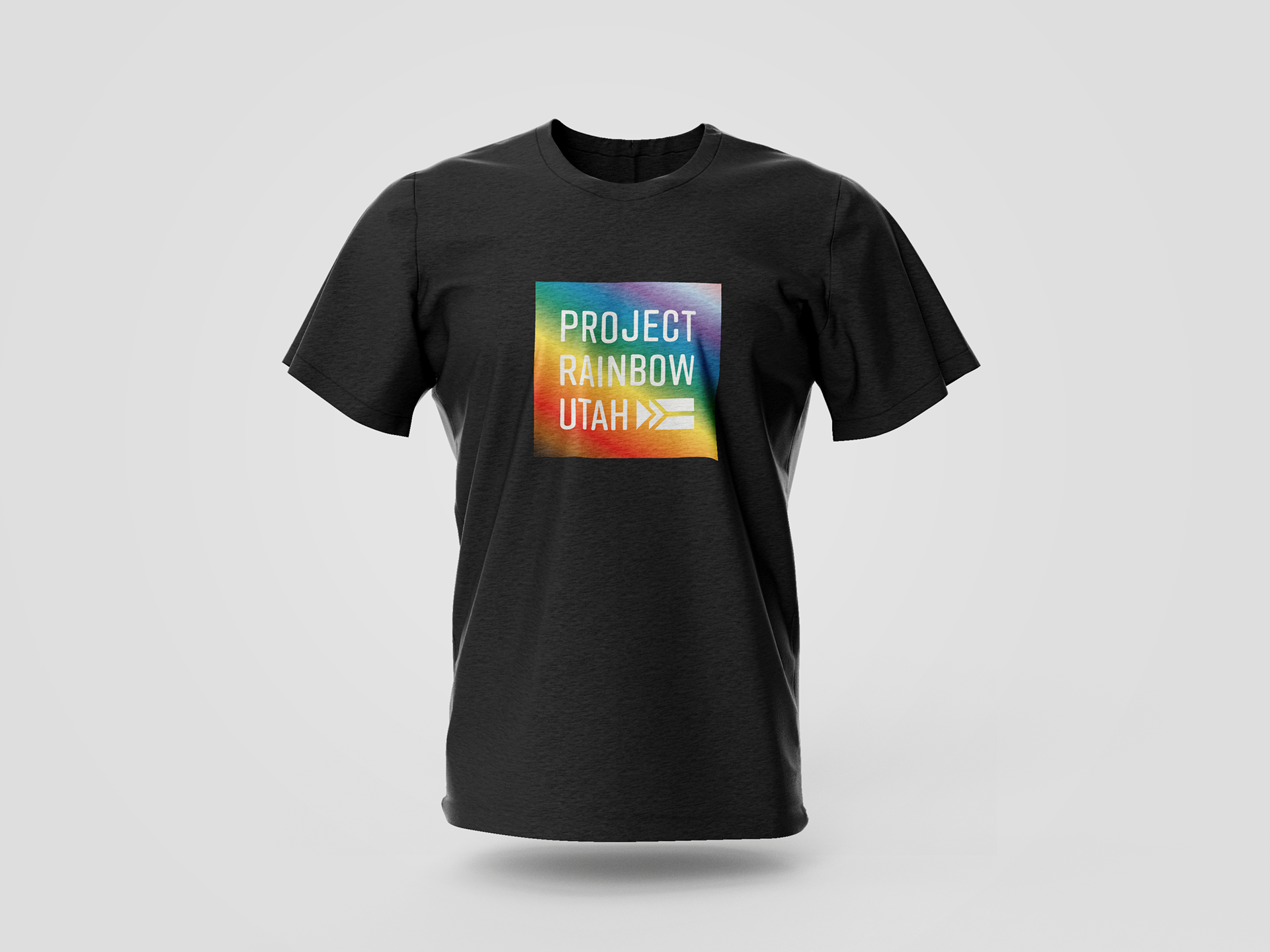
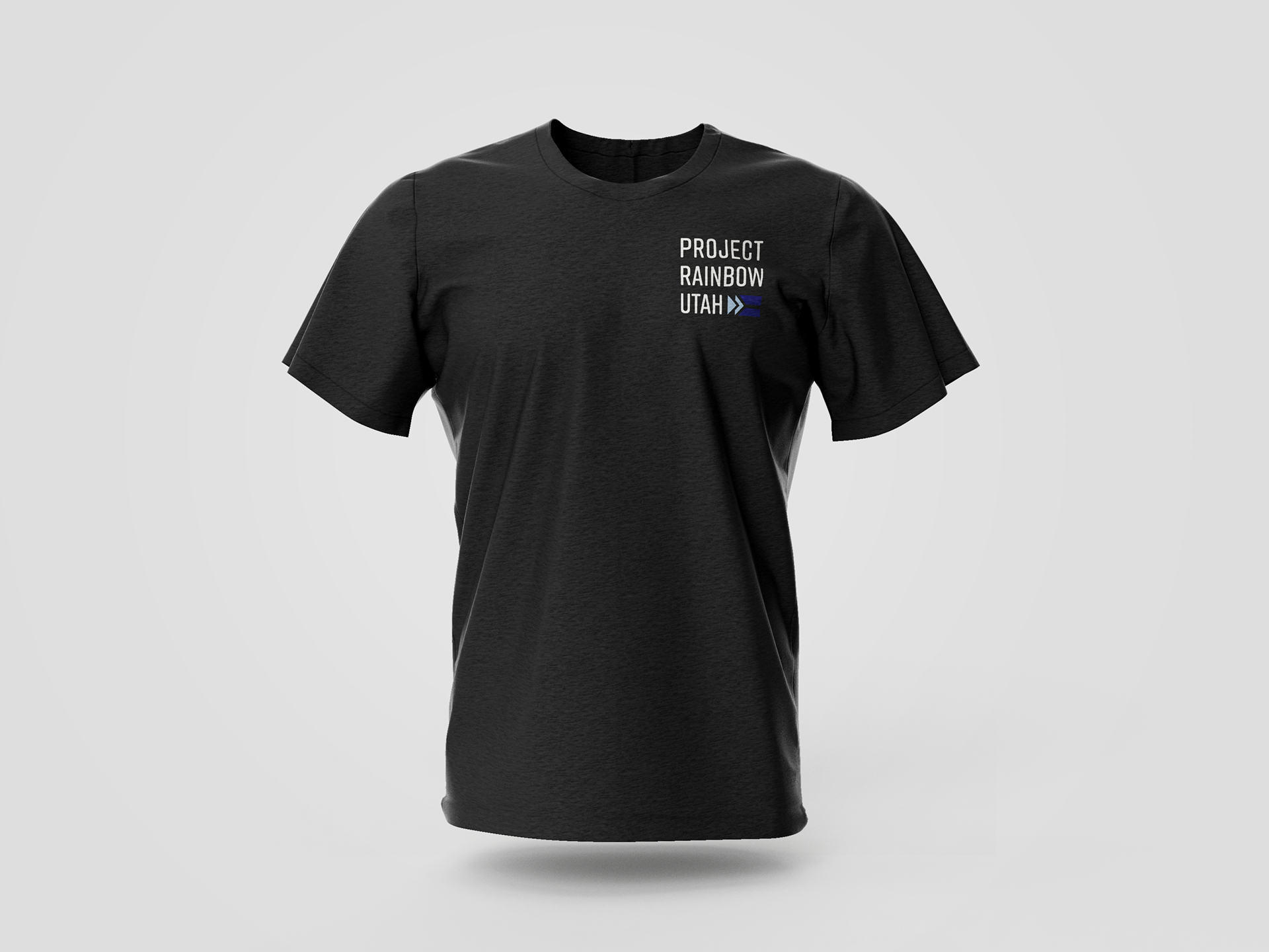
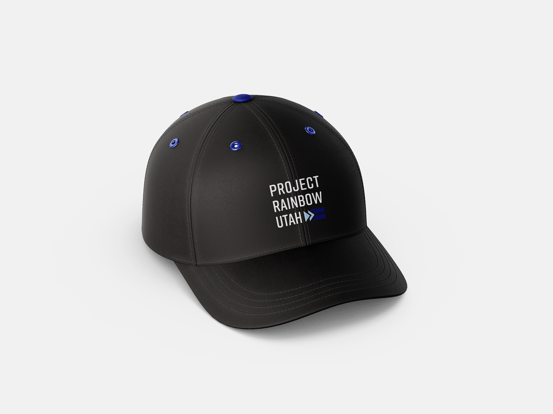
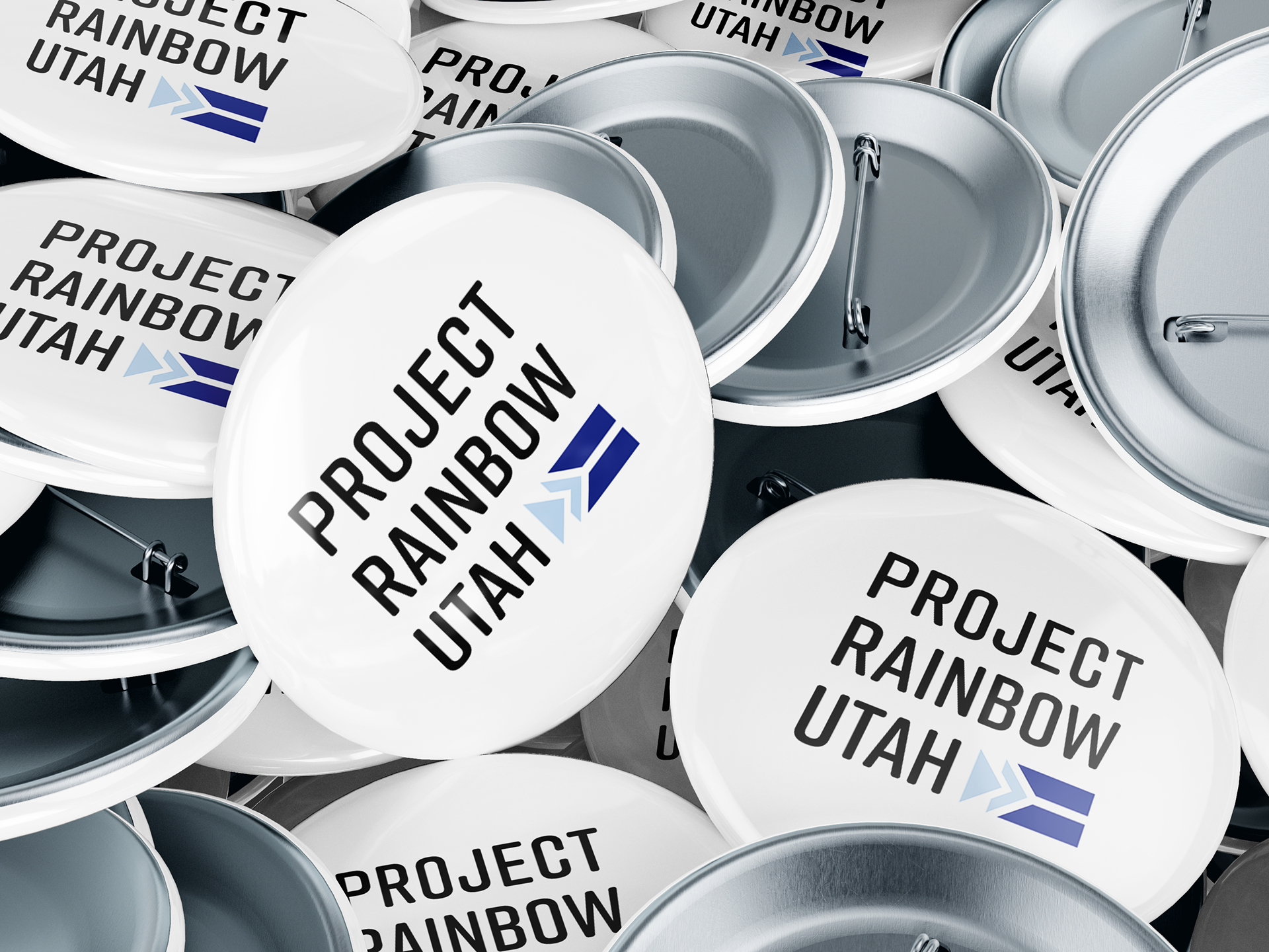
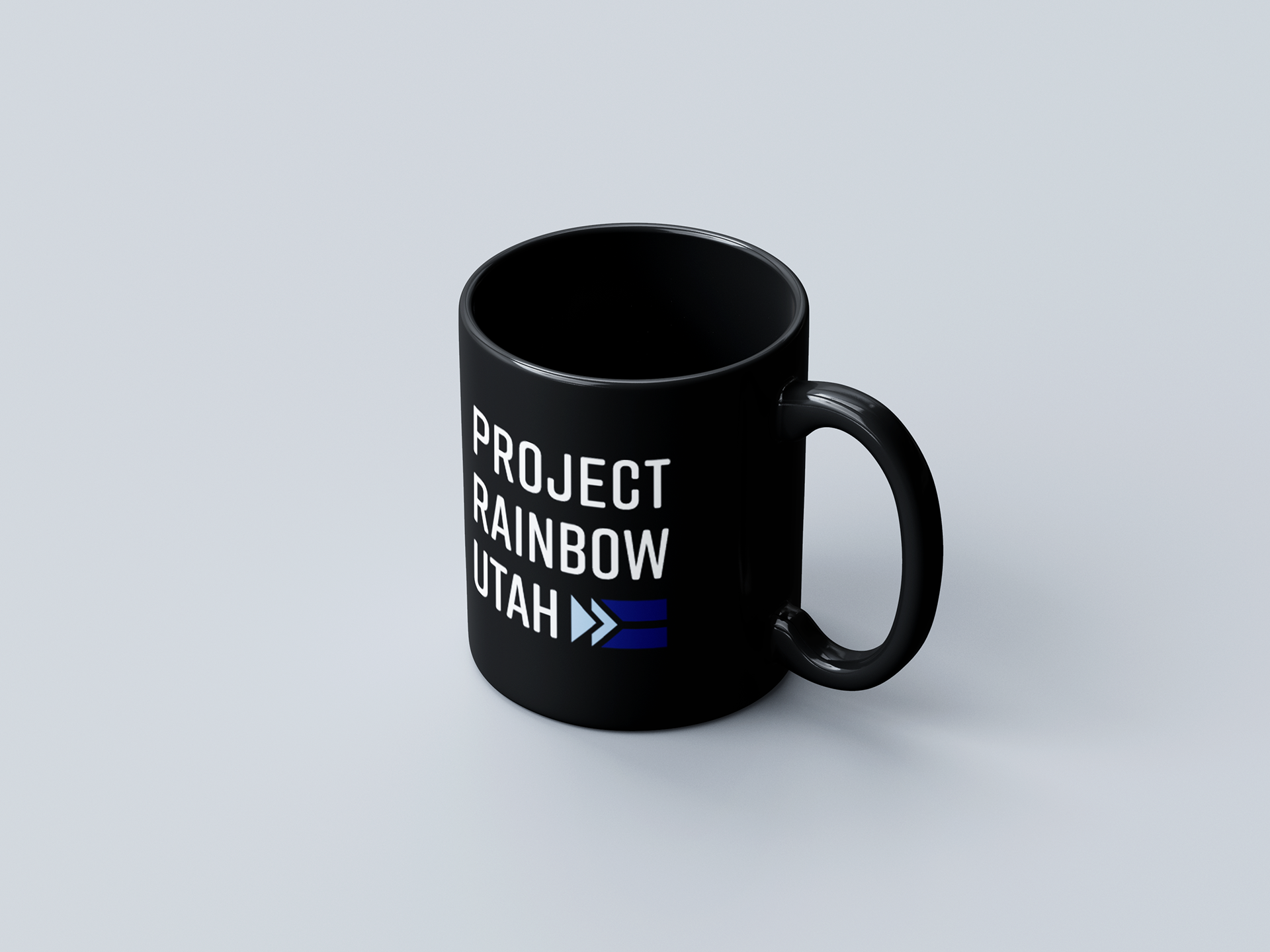
Merchandise
These are a few ideas of what could be sold as merchandise at events or online.
